Graphics are key elements in any trade show exhibit.
A very obvious statement for sure. But, we often see very little thought put into the graphic design of a display. A common mistake is to “slap logos on it” and be done.
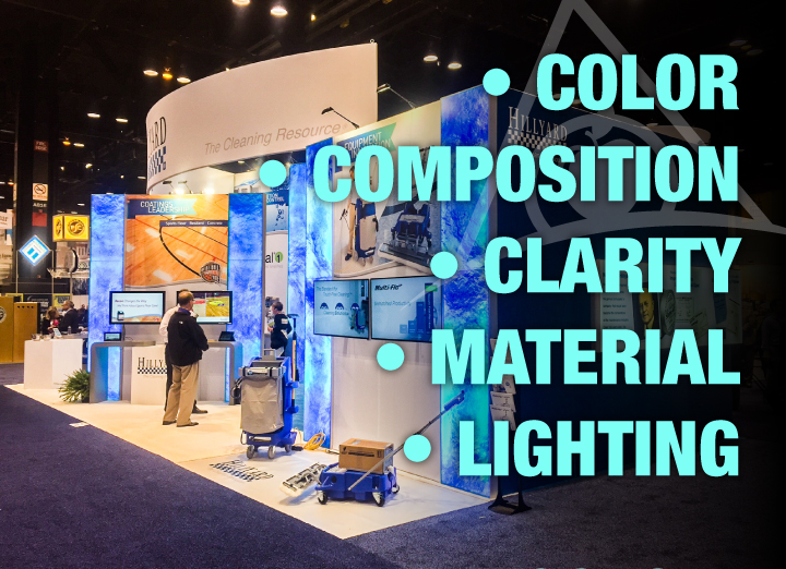
The reality is that graphics will make or break a design and dramatically affect the eventual ROI and ROO from any show. There are many moving parts involved in designing attention grabbing graphics but today we will focus on the 5 most important components of trade show graphic design and how to use them to create an effective exhibit space.
Color
Possibly the most important design element, colors establish moods and elicit emotions. As human beings we make both positive and negative assumptions based on the color scheme we are seeing. Avoid using overly-bright or neon colors if you are striving for a professional look. Instead, focus on large graphics that utilize more reserved color selections to create an inviting and polished environment.
Extend your branding color scheme without introducing a cacophony of new hues that take away from your message. It is also useful to imagine how an exhibit will look up close as well as from far across the exhibit hall.
Composition
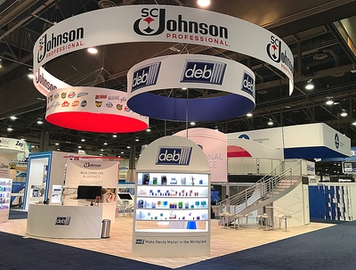 The balance, rhythm, and proportion of images in your graphic layouts can be arranged to create particular moods. Consider the order in which graphic elements need to be seen, as well as what kind of emphasis you want to place on each image. Larger images are usually remembered more vividly. Keep in mind that your logo or brand name can be easier to remember if it is positioned in the upper left of the graphic because of our inclination to start viewing from the upper left. Again, imagine how you want to be seen from a distance as well as from inside the display itself.
Clarity
Being diligent with design details is vital when creating graphics. Errors in the text or grammar will immediately ruin your credibility. Make sure that your graphics are flawless. In addition, your print house must be able to produce graphics of superior clarity and quality. Watch for inconsistant color and imagery on panels not lining up. A fantastic design can be ruined by shoddy printing. Choose your design builder wisely.
Material
New vibrant printable fabric graphics are a great way to draw attention. Tension fabrics can be manipulated into different shapes, allowing you to have anything from cylinders to trapezoids. Backlit graphic lightwalls make logo and photographic elements pop. Semi-private meeting spaces can be created with graphics printed on frosted or clear plexi. There are now many material options for interesting and eye-catching design elements, all of which can be printed with your branding.
Lighting
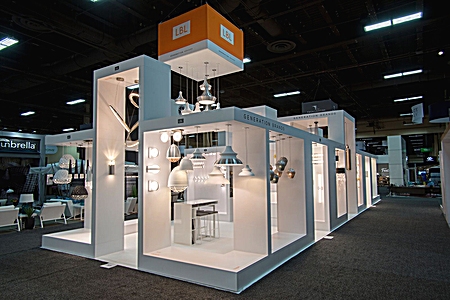
Artistic lighting design can create anything from an ambient, serene glow to a bright and lively look. Targeted lighting can also bring focus to specific messaging or areas of the display.
Each trade show or corporate event may require different graphics based on varying themes, venues, changing booth size and footprints, audiences, industries, or times of year. Make sure your graphics are appropriate for the event you are attending. Your trade show builder will work with you to incorporate the most effective graphic design elements into your display to produce the best results. Creating a stunning booth design and then seeing it come to life can be a truly inspiring and fun aspect of our industry. And this custom designed booth will help you stand out from your competition on the show floor.
Need some design inspiration? Download the free Apple Rock Design Trends Guide for pages of hot new ideas for 2018.
