
In fact, you may not have even noticed that there are a total of 5 A’s in that line. I’m positive you went straight to the one standing alone, and I would have, too.
The main components of every design vary greatly from project to project. From structure to graphics, products, A/V, demos, and more, there’s plenty to consider when orchestrating the “dance” within a good design.
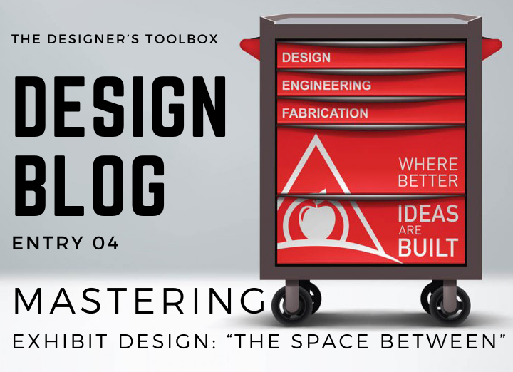
One of the main unspoken elements necessary for an effective composition is the SPACE between everything. Visual breathing room is so important when directing the viewer’s attention to where you want it to be.

When delving into any project, one of the first things we must do is determine what’s necessary and what isn’t a high priority. Then, minimize (if not completely cut) the lesser items. That determined hierarchy of importance helps when tailoring the experience to accomplish specific desired results.
It’s common to have a client wrestle with the urge to showcase a laundry list of products or capabilities.
While I understand the desire to put everything on the table in an effort to not miss a single potential lead, this strategy can also backfire, resulting in a design that’s too busy, overwhelming, and lacking balance and focus.

That space between is a crucial element to give the eye rest and direct attention to where it’s most important. A single red rose on a dinner table conveys beauty and elegance. However, that exact same rose becomes lost in a garden full of blooms.
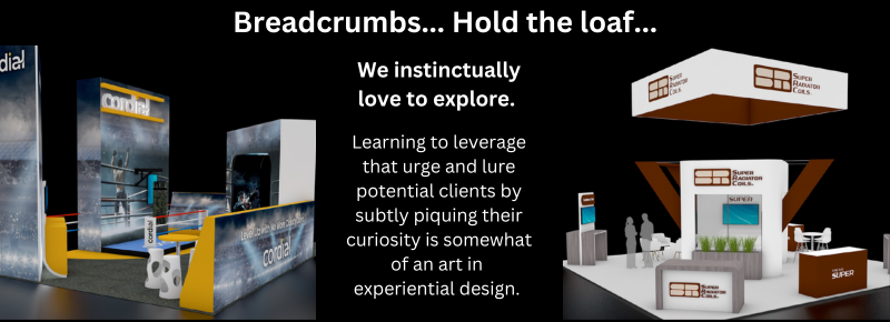
Restraint is a very important part of design and marketing in general.
You’ve never seen an Apple commercial that showcases their entire product line. Apple’s ads always have a clearly defined focus, placing your attention exactly where they want it. It’s not on a catalog of products, but rather an idea of quality and innovation. Car commercials never focus on the full line of an automaker, but instead showcase a specific model.
Putting everything out there not only overwhelms the viewers’ experience but also gives the impression the host lacks clarity in their messaging goals.
There is a saying we’ve used in our marketing in the past:
“Don’t just show up. Show off.”
Well, you can’t show off very well when you’re blending into a crowd. Somehow, you must create separation from the chaotic surroundings of the bustling trade show floor. A well-balanced approach focuses a potential client’s attention, and when done well, also piques interest in what else you may have to offer since you’re not showing your full hand. “If they can do X well, what else do they have to offer?”
Designing WITH SPACE
With products or demos, set them out in a space of their own to send a message of importance. Make sure they have breathing room to focus the viewers’ attention and give extra floor space necessary to actually hold a crowd of people should that attention come to fruition. Highlight them with specialty lighting, A/V, or other unique structural elements to give visual separation from the surroundings, ensuring they are not overlooked by passers-by.
With graphics and messaging, simplify it. PERIOD. Just like driving down the highway and reading billboards, your message needs to be impactful, legible, and clean. A few seconds of confusion, and you lose the viewer for the next thing down the line. Leave details and extended messaging for your collateral, monitor content, and online engagements. QR codes have made a comeback for just this purpose, so printed graphics in your exhibit space can remain focused, clean, and impactful.
OK, I’m going to cut this one off for fear of going against my own message.
Don’t hesitate to reach out and let us design an impactful, well-crafted experience for your brand.
Creatively,
-Jonathan Hackler