The strategy behind Apple Rock’s 2026 event exhibits
When we began designing Apple Rock’s exhibit for EXHIBITORLIVE 2026, we were not interested in creating an experience that simply showed our capabilities or showcased our past work. Our goal was to build something that reflected where the company is headed and, more importantly, to give visitors a practical look at how we think about exhibit design today.
As our Creative Director, Nick Jibben, explained, the intent was to create “a forward-looking expression of the brand, not a retrospective portfolio.”
That idea became the foundation for the entire project.
We wanted the exhibit to function as a working example of how custom fabrication, rental assets, event technology, portable displays, and experiential strategy can be combined into one cohesive environment. Rather than telling visitors what Apple Rock can do, we wanted to show them in a way they could experience and apply to their own event programs.
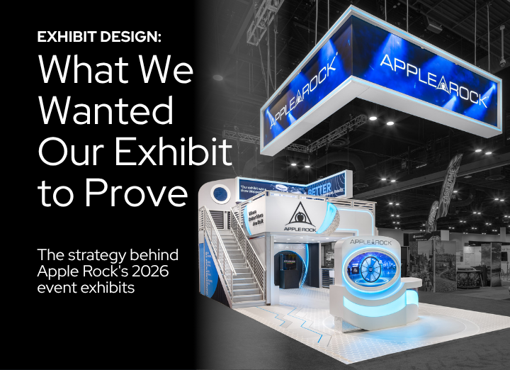
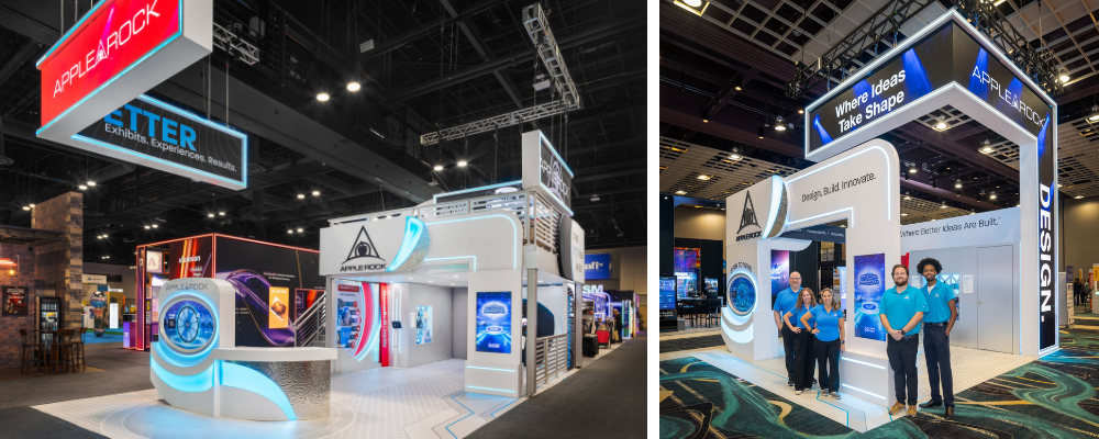
What emerged was a highly interactive 20×40 exhibit for EXHIBITORLIVE in Tampa, followed by a scaled 20×20 version for the Experiential Marketing Summit in Las Vegas. The two layouts were different, but the underlying concept remained the same. Build a strong idea first, then adapt it to fit the event.
That principle guided nearly every decision we made.
It started as a friendly competition
The project began as an internal design competition.
Several members of our design team developed concepts, and those ideas were presented to a committee of executives and department managers. The winning direction was selected not because it looked the most dramatic, but because it best captured what we believe the future of exhibit design should look like.
Senior Designer Colby Ziglar, whose concept was ultimately selected, described the goal this way:
“We wanted to capture what we envision the future of exhibit design to be, incorporating materials, lighting, video, and gamification, while also making use of the entire space, including a double deck from our rental inventory.”
That quote highlights two ideas that shaped the project from the very beginning.
First, the exhibit needed to demonstrate how design and technology can work together to attract attention and encourage engagement.
Second, it needed to be practical.
We were not interested in creating a one-time showpiece that would be difficult or expensive to replicate. We wanted to prove that many of the ideas drawing the most attention could be implemented using assets already available in our rental inventory.
Designing beyond appearance
One of the easiest traps in exhibit design is focusing only on how a booth looks from a distance. Visual impact matters, but appearance alone does not determine whether an exhibit performs well.
What matters most is the experience people have after they enter the space.
As we developed the concept, our team kept coming back to a series of questions:
- Do they immediately understand what we offer?
- Are there places to have different kinds of conversations, from a quick introduction to a deeper discussion about their event strategy?
- Does the layout guide them naturally from one experience to the next?
- Will they enjoy the games, prizes, and conversations enough to remember us after the show?
- Can we communicate our expertise without having to explain every detail ourselves
These were the questions that shaped our design. As our Marketing Manager, Holly Harris, explained:
“The exhibit was conceived as a kind of showroom where visitors could experience technologies and ideas that are available now, either as rentals or as part of larger custom programs.”
That meant every element needed a specific role.
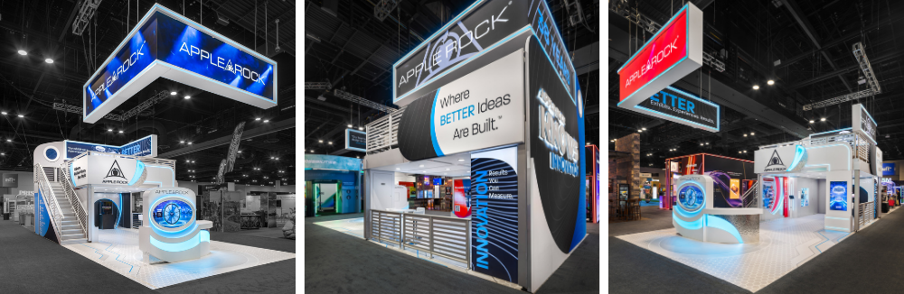
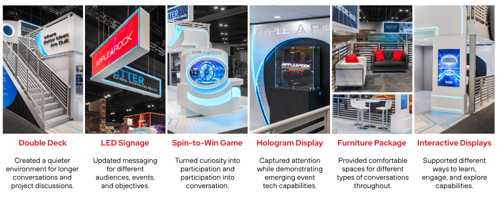
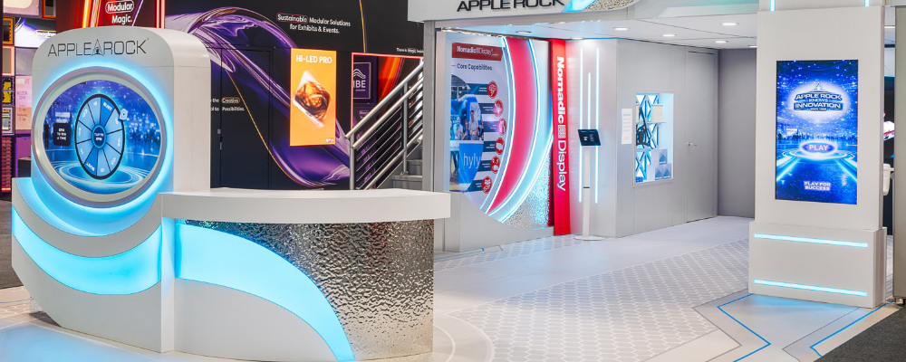
The hanging LED sign served as an immediate visual statement that Apple Rock was here and ready to be noticed. The hologram and video displays helped explain our capabilities in a format that was hard to ignore. The game invited participation. The bar and lounge areas created a more comfortable setting for meaningful discussions. Even the flooring and lighting were used to guide movement and establish visual hierarchy.
Nothing was added simply because it looked impressive. We made sure every feature had a job to do.
Why we used a double deck
The double deck was one of the most talked-about features of our exhibit, and for good reason.
From a distance, it gave the booth height and a commanding presence. It made our exhibit visible from each entry point and signaled that something substantial was happening inside. It was also the only double deck at EXHIBITORLIVE 2026.
But visibility was only part of the story we wanted to tell.
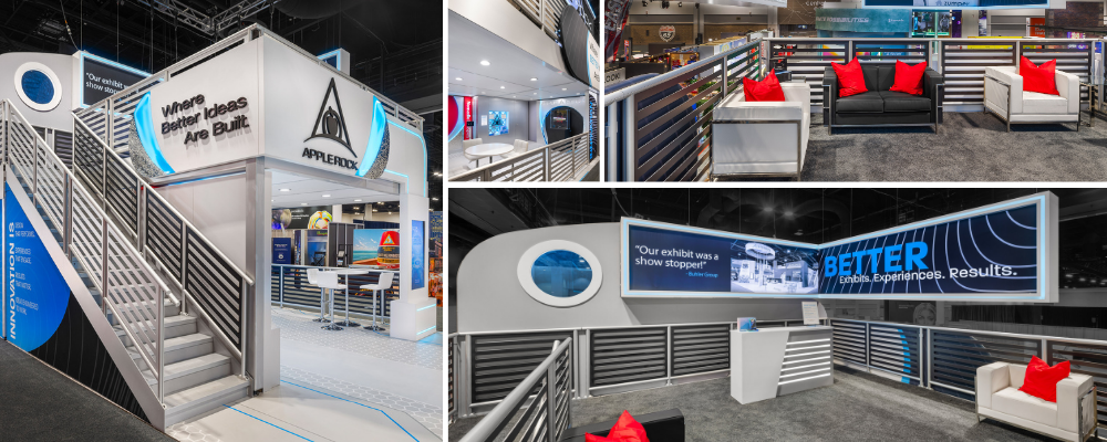
Our team used the second level to create a completely different environment from the activity below. The lower level was energetic and interactive, filled with movement, technology, and opportunities to engage. The upper level provided a more private setting where prospects and clients could sit down, review ideas, and discuss budgets, schedules, and program goals without competing with the constant noise and motion around them.
That distinction is important.
Not every interaction serves the same purpose. Some are designed to attract attention and spark curiosity. Others create the right setting to move beyond introductions and start talking about real projects.
Perhaps the most practical takeaway is that the double deck itself came from our rental inventory. For exhibitors considering a second level, that means this option can be far more attainable than you might realize.
Rental components hidden in plain sight
In fact, several major components in this exhibit were rentable, including the double deck and a number of technology and architectural elements. In total, roughly six core features were drawn from existing inventory.
One of the most valuable lessons we wanted to demonstrate through this project is that highly customized exhibits do not have to be built entirely from scratch.
This approach gave us tremendous flexibility. It reduced fabrication time, controlled costs, and made it easier to adapt the concept for future events. It also allowed us to focus our custom efforts where they would have the greatest effect rather than reinventing elements that were already proven.
To most visitors, the exhibit appeared to be a fully custom environment, and in many ways it was.
The difference is that the most effective solutions often blend custom design with rental assets rather than forcing clients to choose one or the other.
That is where experience makes a difference.
Gamification as an invitation
We do not view games as entertainment for entertainment’s sake. We include gamification in our exhibits because it creates measurable results while giving visitors a memorable reason to engage with us.
Trade show attendees are often intrigued by what they see, but many hesitate to walk directly into a sales discussion. A game removes much of that hesitation. It creates an easy first interaction that feels natural and enjoyable rather than transactional.
Once someone begins playing, the conversation tends to unfold on its own. Our team has an opportunity to learn about their challenges, upcoming events, and the goals they are trying to achieve.
As Colby noted, “the gamification component not only increased interaction but also gave attendees the opportunity to win prizes, making the experience memorable and enjoyable.”
We knew the game would not be a distraction. It would be a strategically designed first step that lowered hesitation, encouraged participation, and opened the door to deeper conversations.
Materials, lighting, and attention to detail
Visitors often take in the exhibit as a whole before they begin to notice the individual decisions that shape their impression.
Backlit graphics, dimensional lettering, integrated LED accents, printed flooring, laminate finishes, fabric structures, and aluminum framing all worked together to create depth and texture.
The goal was not to showcase as many materials as possible. It was to demonstrate how contrast, lighting, and layering can make an exhibit feel more refined and more intentional.
Lighting played an equally important role. Rather than treating illumination as decoration, we used it to establish hierarchy, highlight focal points, and draw attention to key features.
These are the kinds of details that may not stand out on their own, but together they have a significant influence on how people experience a space.
This is often where the value of working with an experienced exhibit partner becomes most apparent. The decisions that seem small on their own can dramatically affect how polished, purposeful, and memorable the final environment feels.
A dedicated space for Nomadic Display
We also wanted to include a dedicated area for Nomadic Display, Apple Rock’s portable and modular exhibit brand.
This gave visitors an opportunity to see a very different side of our business and reinforced an important point: not every exhibitor needs a large custom island to achieve their goals.
Some companies need lightweight systems that ship easily, set up quickly, and can be reconfigured over time. Others benefit from a combination of portable displays, rentals, and custom components that work together across different events and budgets.
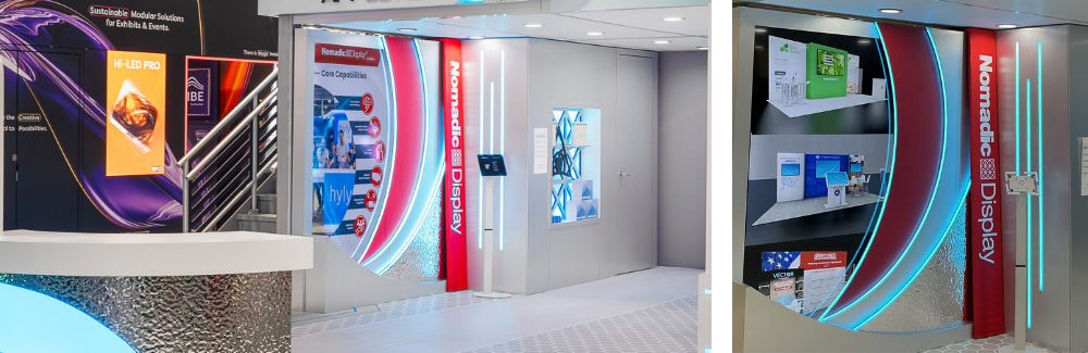
Our goal was to demonstrate that the best solution is rarely defined by a single product category. It is defined by what makes the most sense for your objectives, your budget, and your event schedule.
By incorporating Nomadic into the exhibit, we were able to show that whether you need a portable display for regional events, a rental for a major launch, or a fully custom environment, the most effective strategy starts with choosing the right tools for the job.
From EXHIBITORLIVE to EMS
After EXHIBITORLIVE, we reworked the exhibit for the Experiential Marketing Summit in Las Vegas.
The footprint changed from 20×40 to 20×20, and the most obvious difference was that the double deck was removed. Even so, the exhibit still felt like the same experience.
That was one of the most important things we wanted to prove.
When you build around a strong idea instead of a fixed layout, the size can change without losing what made the exhibit effective in the first place. Some elements may be removed, others may take on a larger role, and the overall footprint may become more compact, but the core concept remains intact.
In our case, the same overall look and feel, lighting, technology, gamification, and messaging carried forward into the smaller space. The exhibit was instantly recognizable, even though the structure itself was very different.
For companies attending multiple events with different booth sizes, this can be a much smarter way to invest. Rather than starting from scratch each time, you build a concept once and adapt it to fit the event.
That approach allowed us to create two very different exhibits that delivered the same core experience and told the same story.
Where Better Ideas Are Built
Apple Rock CEO Eric Burg often says that our mission is to bring thought leadership to the exhibit and event industry.
For us, that means more than sharing ideas. It means putting those ideas to work, testing them in real environments, and showing our clients what is possible when strategy, design, and execution are aligned.
The exhibits we created for EXHIBITORLIVE 2026 and EMS 2026 were designed to do exactly that.
Together, they showed how one concept could combine custom fabrication, rental inventory, event technology, hospitality, and portable solutions into a single exhibit experience.
More importantly, they demonstrated that effective exhibits are built around how people move, interact, learn, and make decisions. That is the lens we use when designing for our clients.
For nearly four decades, Apple Rock has partnered with more than 15,000 clients worldwide to create exhibits, branded environments, and live events that support measurable business goals.
That is how better ideas are built.
The best exhibit strategies are built around specific goals, audiences, and challenges. Tell us about yours.