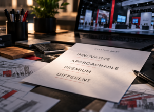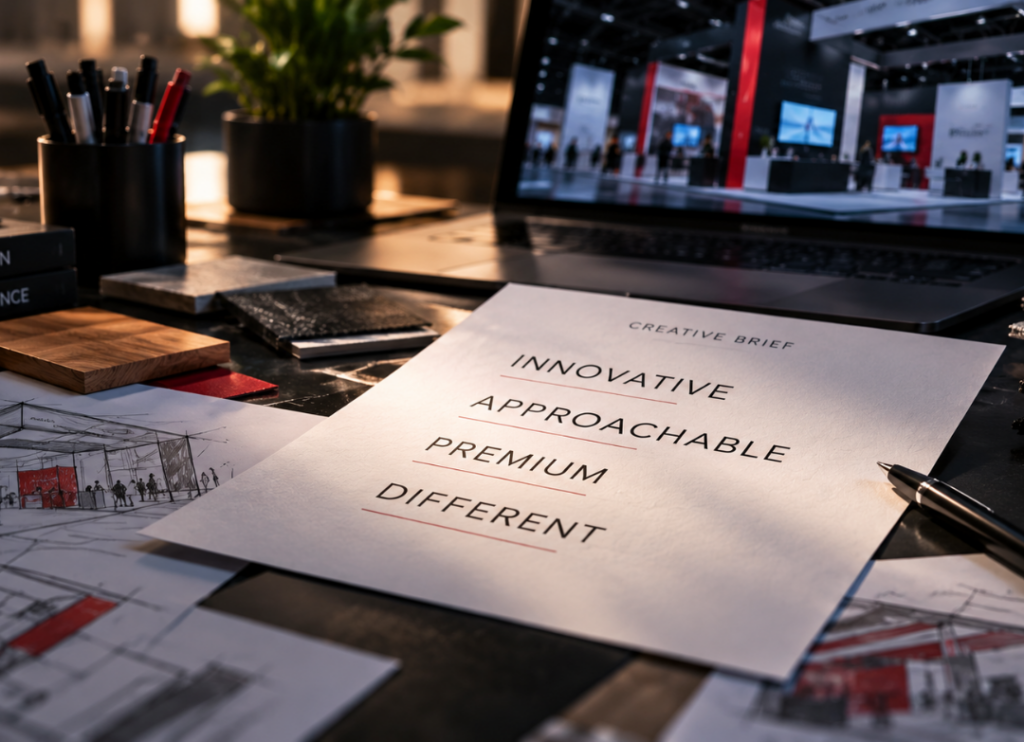
Innovative. Approachable. Premium. Different.
I see words like these attached to brands all the time, and there is nothing wrong with any of them. Heck, we use them too. The problem starts when we expect them to tell us what an experience should be.
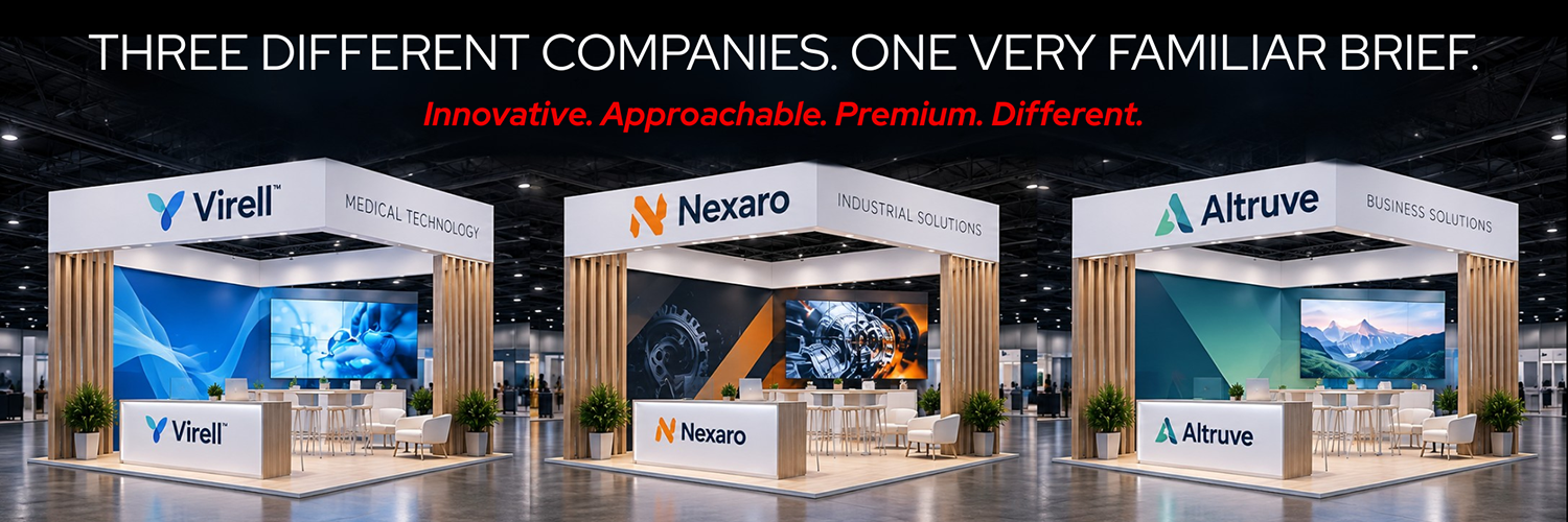
If three companies can hand me essentially the same list of adjectives, those words are not enough to determine what any one of their environments should look like, how it should behave or what people should experience inside it.
That is where a creative brief has to go deeper. The most useful details aren’t necessarily about how you want the experience to look. They’re about what you need it to accomplish.
I need to know what people do not understand yet about your company. I want to know what customers consistently get wrong about you or your products. I want to know what sales spends too much time explaining, what has changed since the last event and what this audience needs to leave understanding that they may not understand when they arrive.
Those are the answers that give me something I can design around.
Give me the problem, not the adjective
Let’s break this down. Suppose two companies both want to be perceived as innovative.
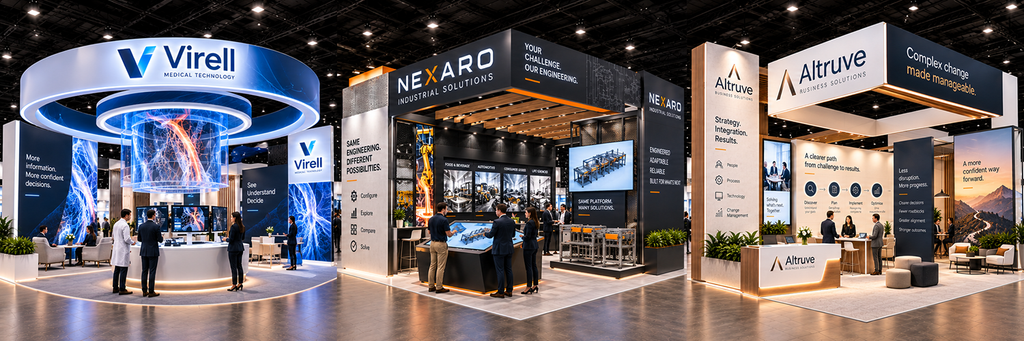
The first has developed a product with impressive engineering that is largely hidden once the product is assembled. Customers see the finished product, but they do not necessarily understand what makes it different.
That is a design problem.
We might expose components that are normally hidden, demonstrate the engineering at a larger scale or create a way for people to compare what is happening inside the product. The experience can make something difficult to see easier to understand.
The second company sells a sophisticated service that customers routinely assume will be complicated to implement.
That is an entirely different design problem.
Showing more may make matters worse. We may need to reduce information, simplify the path through the experience and make the first interaction unusually easy. If simplicity is part of the value proposition, people should not have to work through a complicated environment to discover it.
Both companies may legitimately call themselves innovative.
But notice that word did not lead us to either solution. Understanding the core problem did.
This is why one of the questions I find most useful at the beginning of a project is:
What do we need to make easier to understand?
The answer is often far more valuable to a creative team than another page of adjectives.
Brand guidelines can’t do all the work
Your brand guide gives us essential tools. It establishes your visual language of the company through typography, color, imagery, logo usage and other standards.
Following those standards correctly does not automatically create a branded experience.
You can build an entire environment in the correct colors, use the correct typefaces, follow every logo rule and still create something that could belong to almost anyone.
Brand compliance and brand expression are not the same thing.
Experiential design gives us a much larger vocabulary than a logo, color palette and typeface.
We can work with scale, material, sound, movement, lighting and technology. We can decide whether a product is protected behind glass or placed directly into someone’s hands. We can make an experience self-guided or intentionally dependent on conversation. We can reveal how something works or deliberately simplify it. We can create a space that moves quickly or gives people permission to stay.
Those decisions communicate too.
If personal service is central to the brand, an experience dominated by self-service technology deserves scrutiny. If transparency is part of the company’s value, hiding the interesting parts of its process behind finished graphics may be a missed opportunity. If a product’s advantage is simplicity, forcing someone through six steps to experience it creates a contradiction no brand color can fix.
That is where brand expression becomes more interesting than brand application.
Tell me what should win
Another thing I need from a brief is hierarchy.
You rarely come to an event with only one thing to communicate. There may be a new product, an established product that still drives revenue, a corporate message, several audiences and multiple business units with legitimate objectives.
The problem starts when everything is treated as equally important. It rarely is.
If everything is emphasized, the audience has to create the hierarchy for themselves. What they remember may simply be whatever they happened to encounter first, not necessarily what mattered most.
So, I want to know:
What should someone remember when they walk away from your event or show?
That does not mean the entire experience has to communicate just one message. It means we know what deserves to win when two priorities compete for the same attention, space or time.
That decision affects much more than graphics. It can determine where the eye goes first, what receives the most physical space, which product gets demonstrated rather than displayed and where people are encouraged to spend their time.
If the answer is five things, we have not established hierarchy yet.
Bring inspiration. Just bring the reason with it.
When someone shows me an experience, an installation or a piece of technology they like, I want to know why it worked and why they liked it.
Maybe the giant interactive display was impressive because several people could explore complicated information at the same time. Maybe the unusual lighting treatment successfully shifted the mood between two parts of an event. Maybe a product demonstration was memorable because it let people see something they normally have to take on faith.
Once we understand the reason, we no longer have to reproduce the execution.
We can solve the same underlying problem in a way that makes sense for your audience, your objective and your brand.
That distinction matters because experiential design is full of things that are easy to want after seeing them somewhere else. LED walls, interactive technology, immersive content and dramatic architectural treatments can all be excellent tools.
“We want one of those” is a starting point.
“Here is what we need it to accomplish” is a creative direction.
Give us something to design around.
Tell me what your customers need to understand, what makes your company different and what needs to happen as a result of the experience.
The strongest creative direction doesn’t tell me what something should look like. It gives me a reason for it to look the way it does.
Related Insights
- “Innovative” Doesn’t Tell Me What to Design
 Innovative. Approachable. Premium. Different. They may describe how you want your brand to be perceived, but they don’t tell a creative team what to design. A stronger brief gives creative something far more useful: a problem worth solving.
- What We Wanted Our Exhibit to ProveThe strategy behind Apple Rock’s 2026 event exhibits. A forward-looking concept designed to demonstrate how strategy, technology, rental assets, and custom fabrication can work together to create more engaging and adaptable event experiences.
- Apple Rock Earns Three Hermes Creative Awards for 2026 Exhibit Design ExcellenceApple Rock earned three Hermes Creative Awards for 2026, recognizing a strategy-first approach to exhibit design. From large-scale double decks to flexible exhibit systems, each project was built to guide engagement, support real interaction, and perform when it matters most.
- Busy Isn’t the Goal. Results Are.Trade show exhibits can be busy without delivering actual results. This article explores why “busy” activity alone isn’t enough and how strategic exhibit design turns traffic, conversations, and engagement into measurable business outcomes.